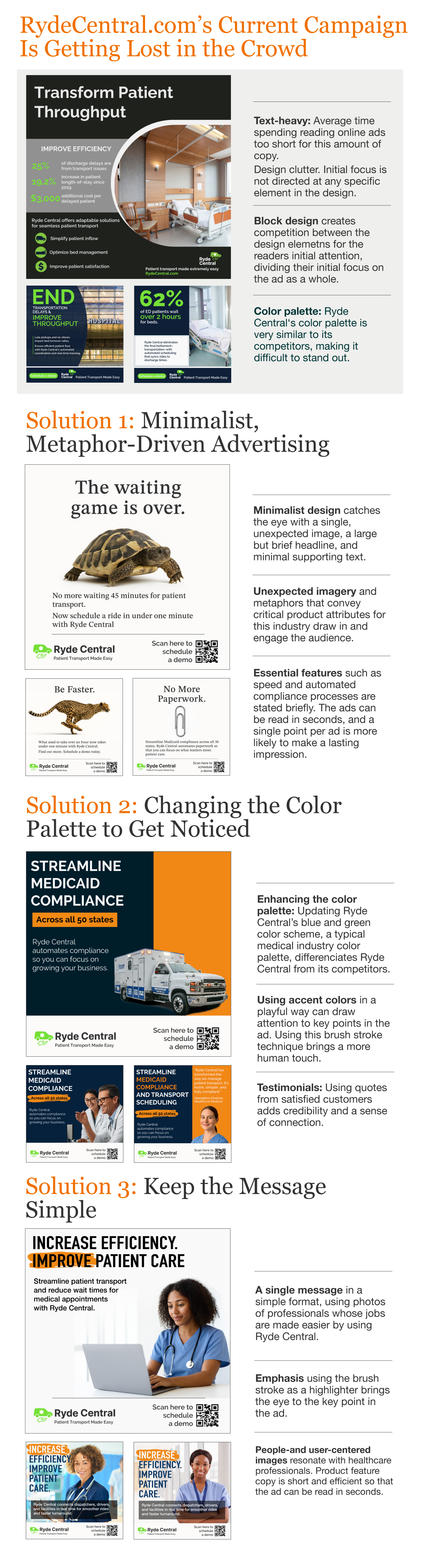
Ryde Central’s original campaign was getting lost due to heavy text, cluttered layouts, and a color palette indistinguishable from competitors. To improve differentiation and message clarity, three solutions were developed.
A minimalist, metaphor-driven approach uses bold, unexpected imagery to deliver Ryde Central’s value propositions in seconds. A new color palette moves the brand out of the typical healthcare blues and greens, helping the ads stand out visually. And a simplified messaging strategy focuses each ad on one clear, compelling point for faster audience comprehension.
Together, these solutions strengthen Ryde Central’s visibility, sharpen its market positioning, and ensure its benefits are communicated quickly and memorably.