Designing Clarity From Complex Global Data
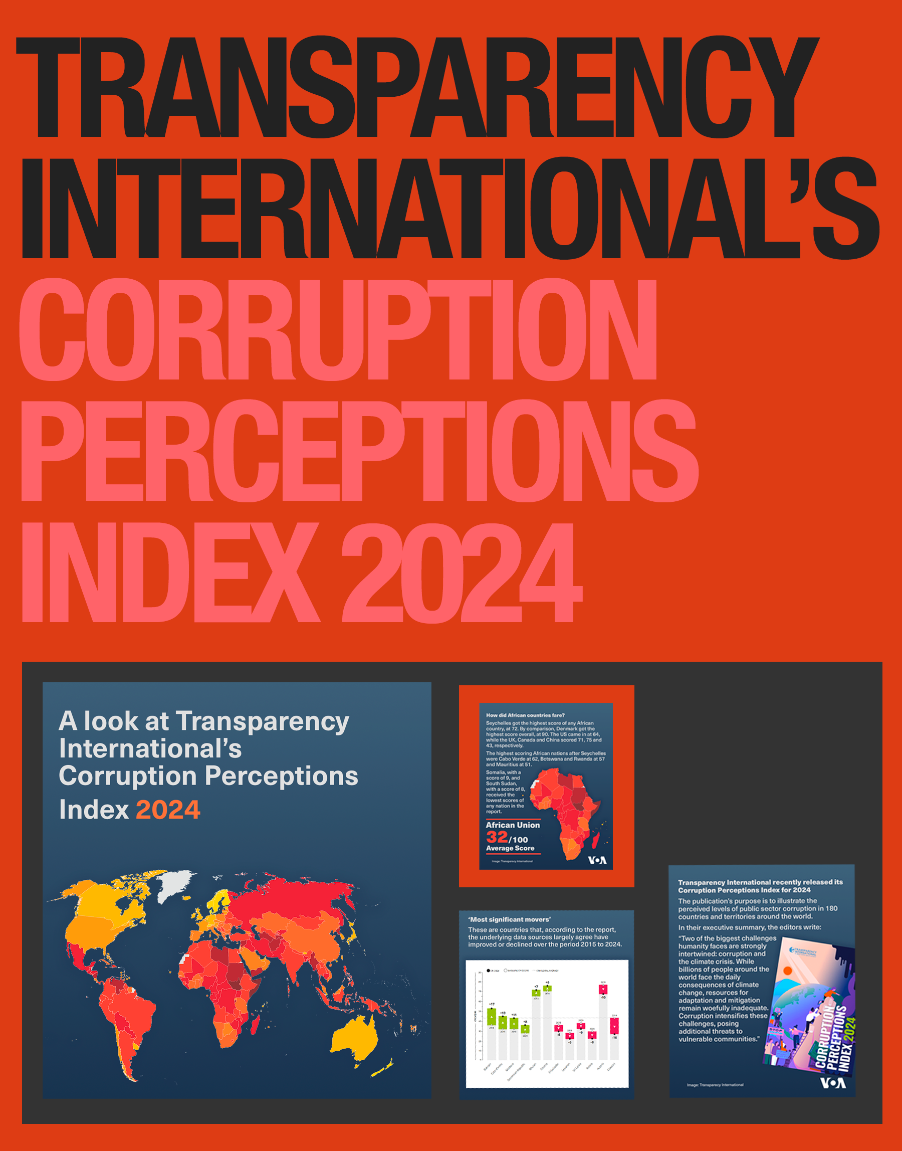
As a UX-focused visual journalist at Voice of America, I created this explainer to help audiences quickly understand Transparency International’s 2024 Corruption Perceptions Index, a dataset that can easily feel dense or abstract.
My goal was to translate global corruption trends into a clear, intuitive visual narrative that guides the viewer from high-level context to regional detail.I applied UX principles to shape hierarchy, flow, and readability: bold introductory framing, digestible text blocks, and modular panels that allow users to scan or dive deeper as needed.
The color-coding, map styling, and chart treatments were all chosen to reinforce comprehension, reduce cognitive load, and support accessibility.This piece demonstrates how I use design to make complex global information approachable and meaningful, ensuring that audiences can quickly understand not just the data, but the story behind it.